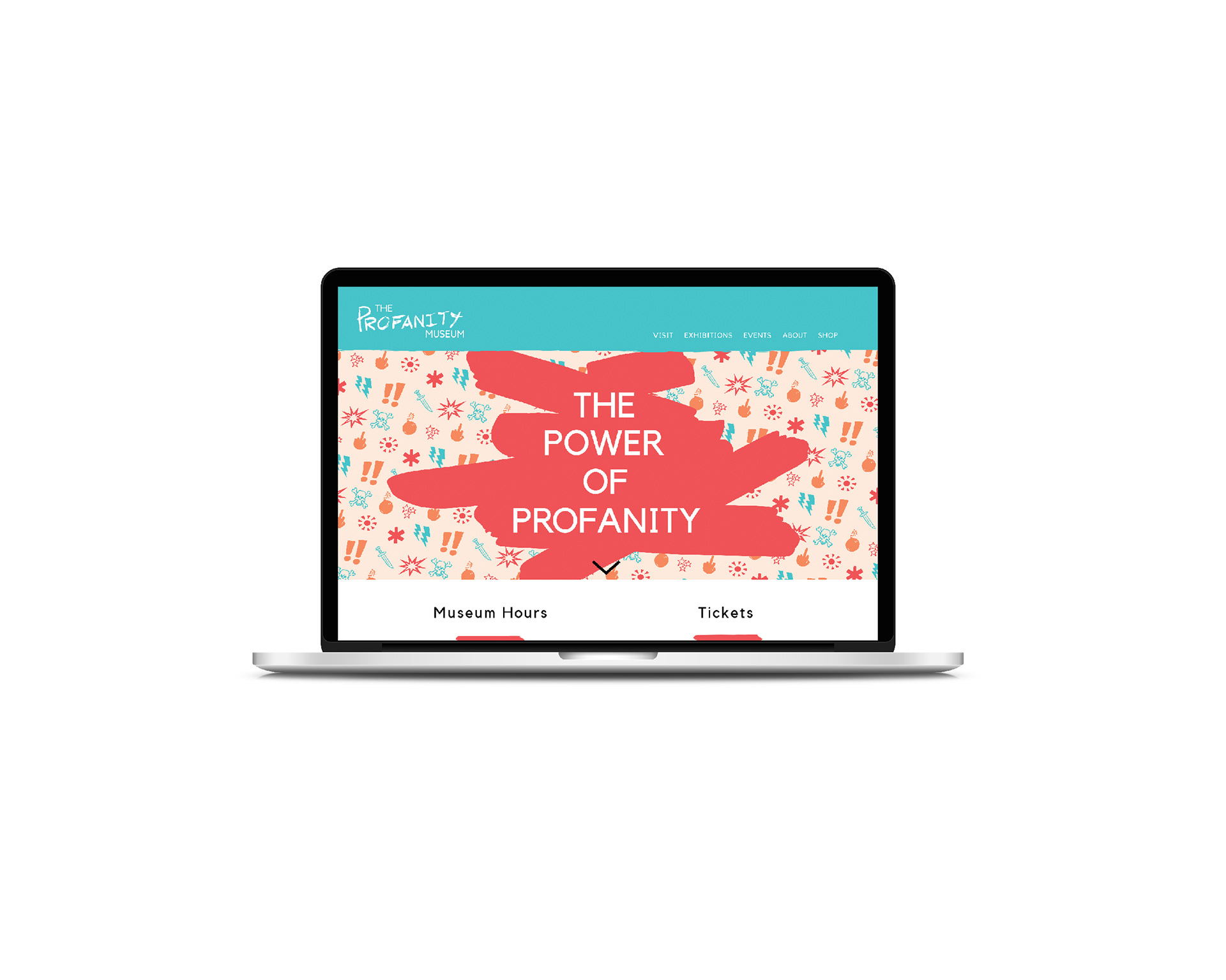
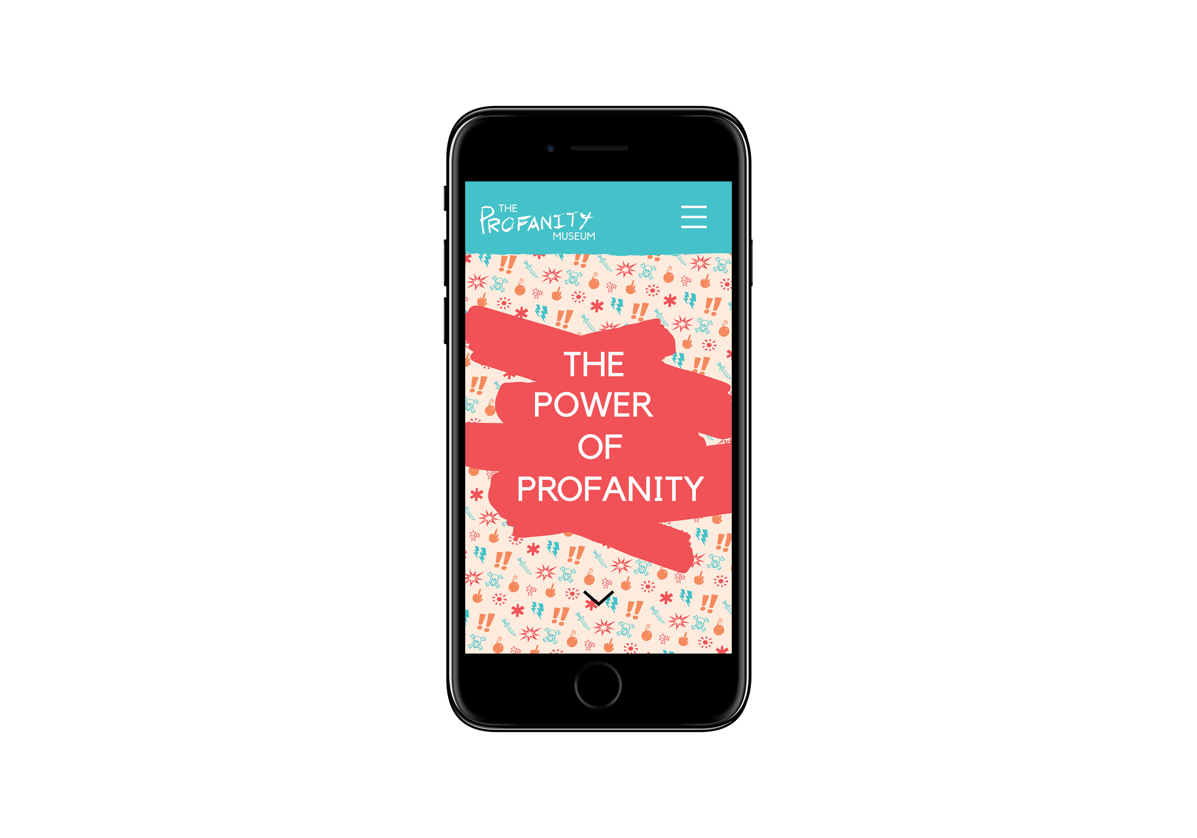
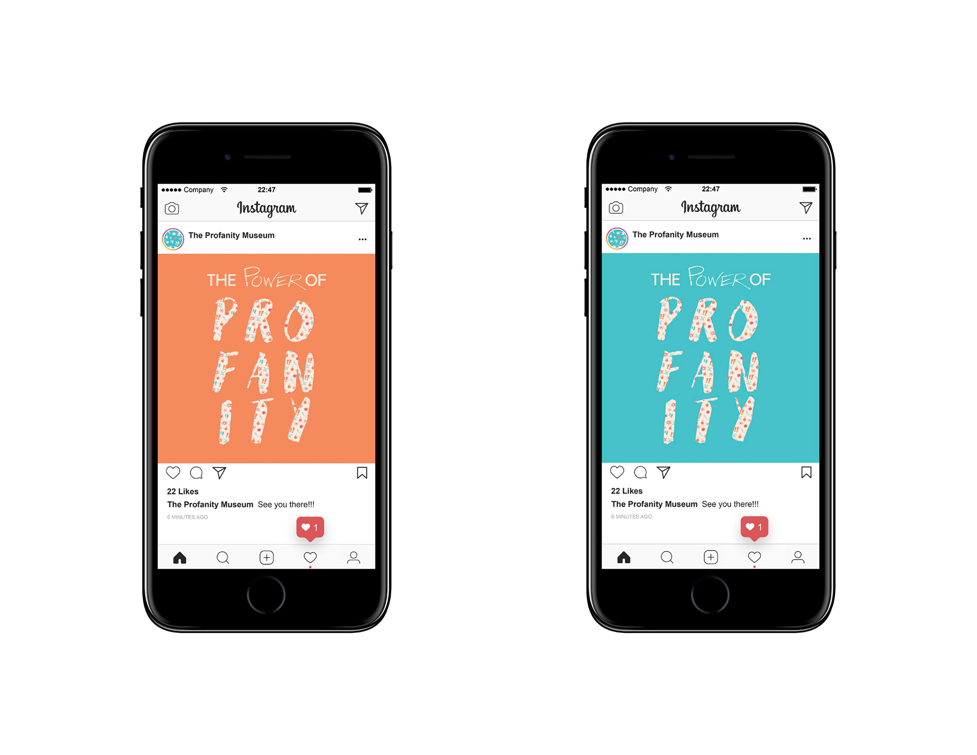
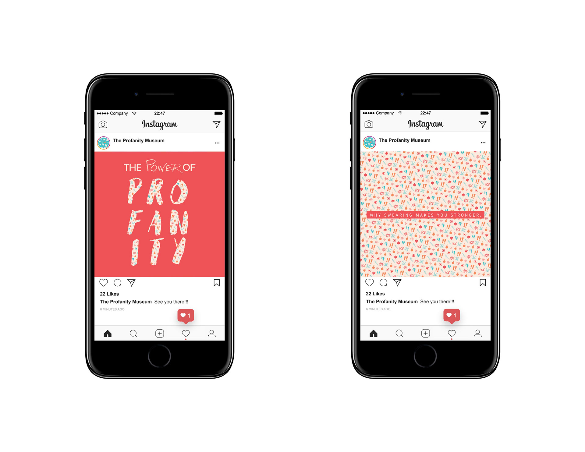
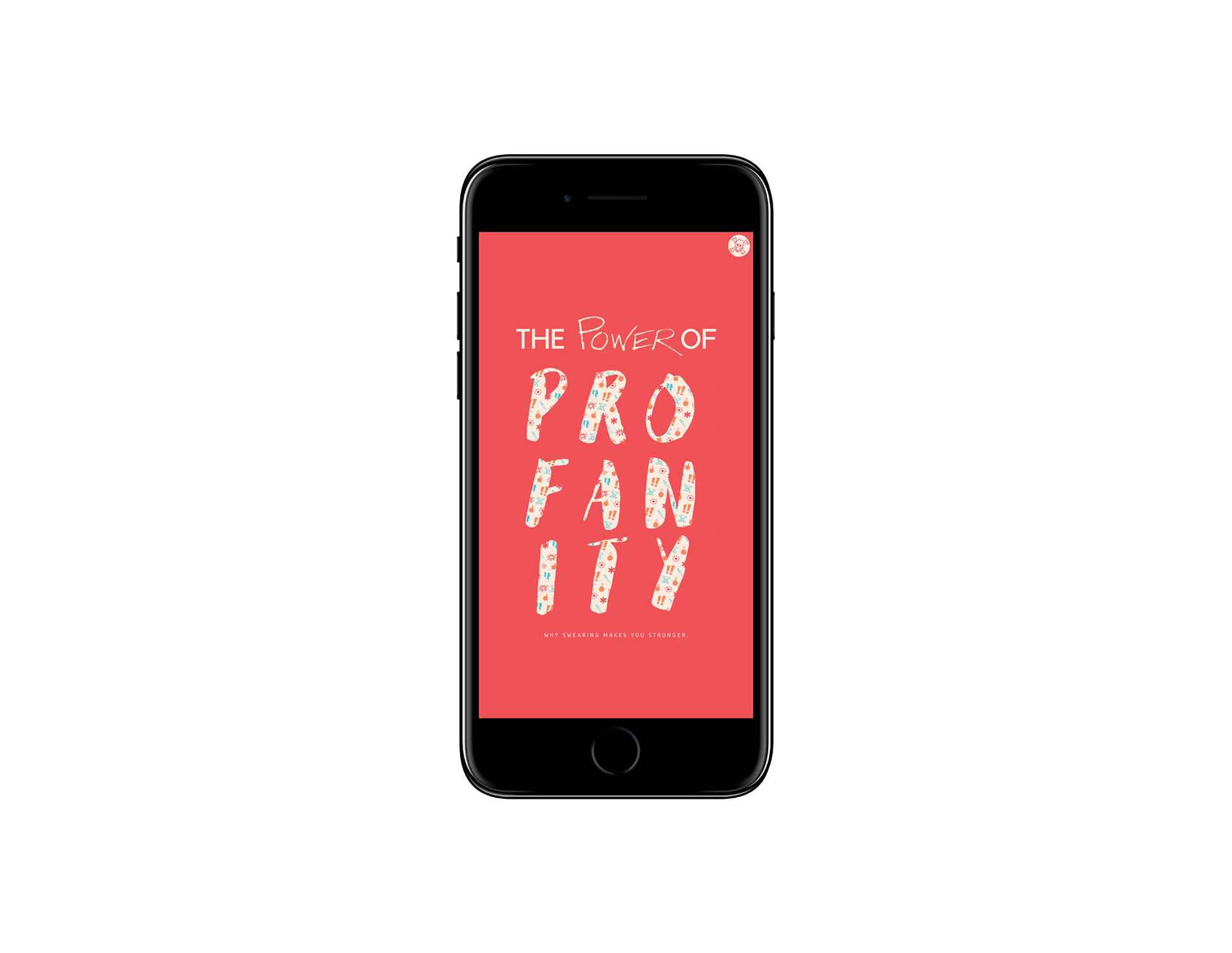
The design concept behind the logotype was to convey a sense of bright, messy, humor. To put the feeling of the logo and brand in sharp contrast to its content. It is intended to be ironic but in the most cheerful way possible.
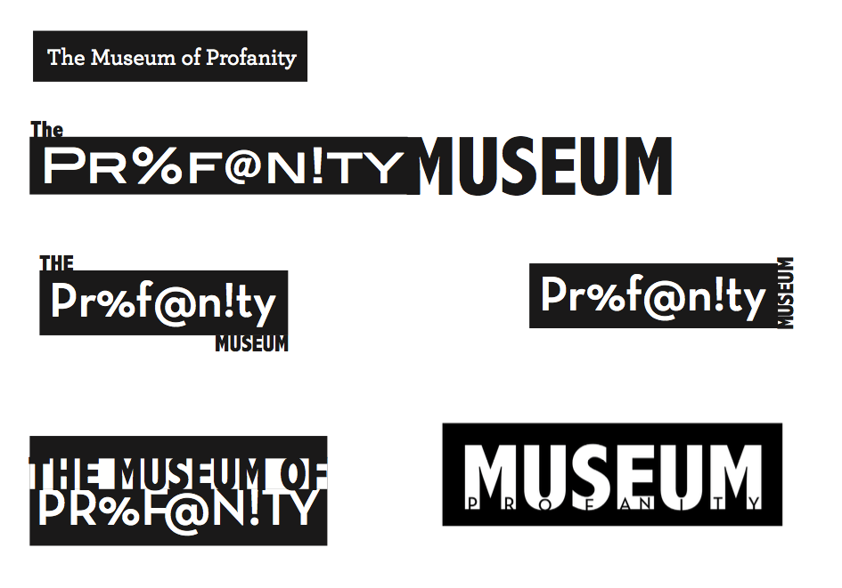
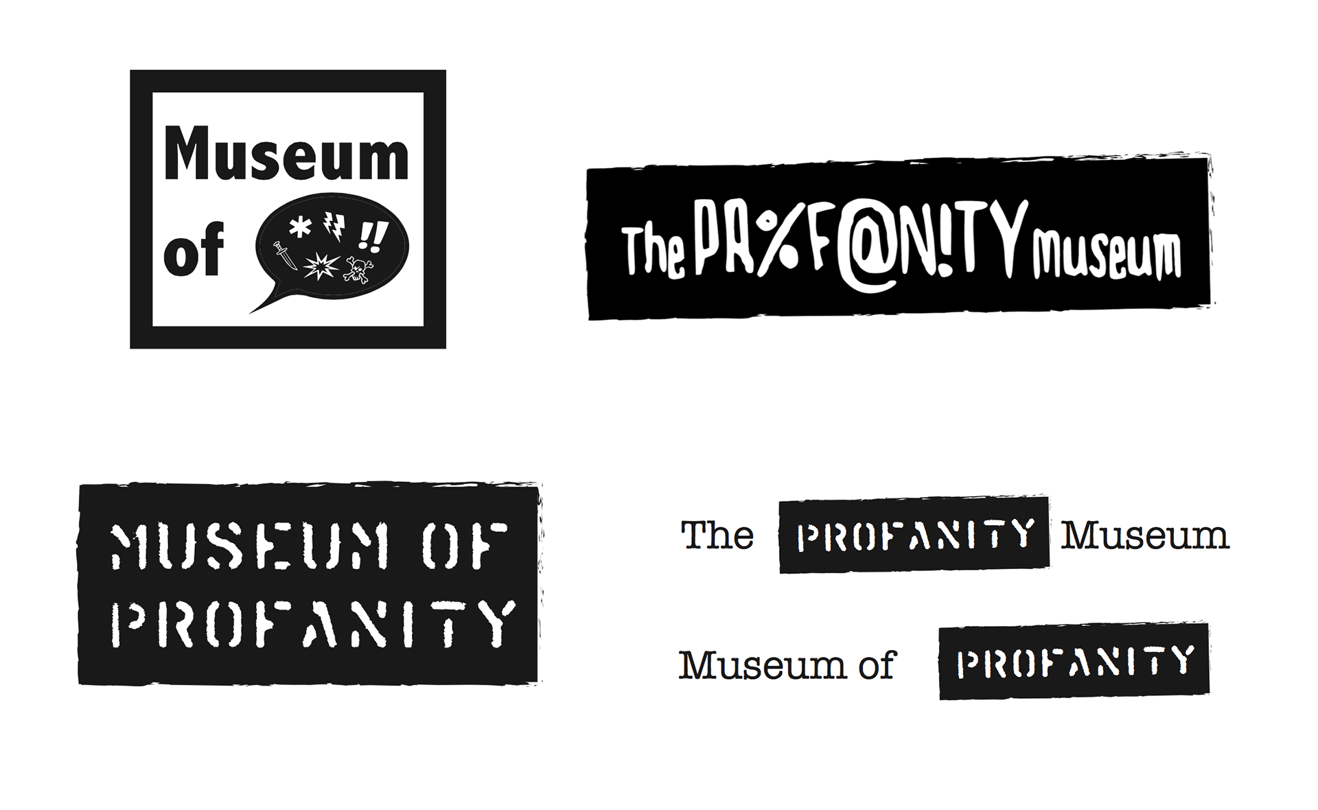
Below are a few of my early logo designs:

This is the logo design I settled on:
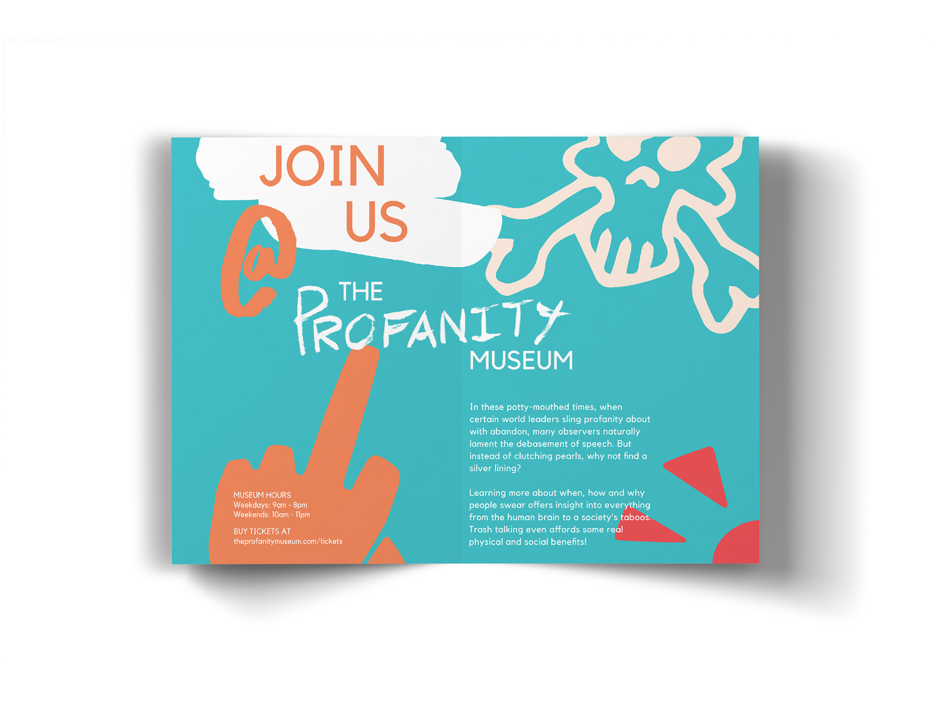
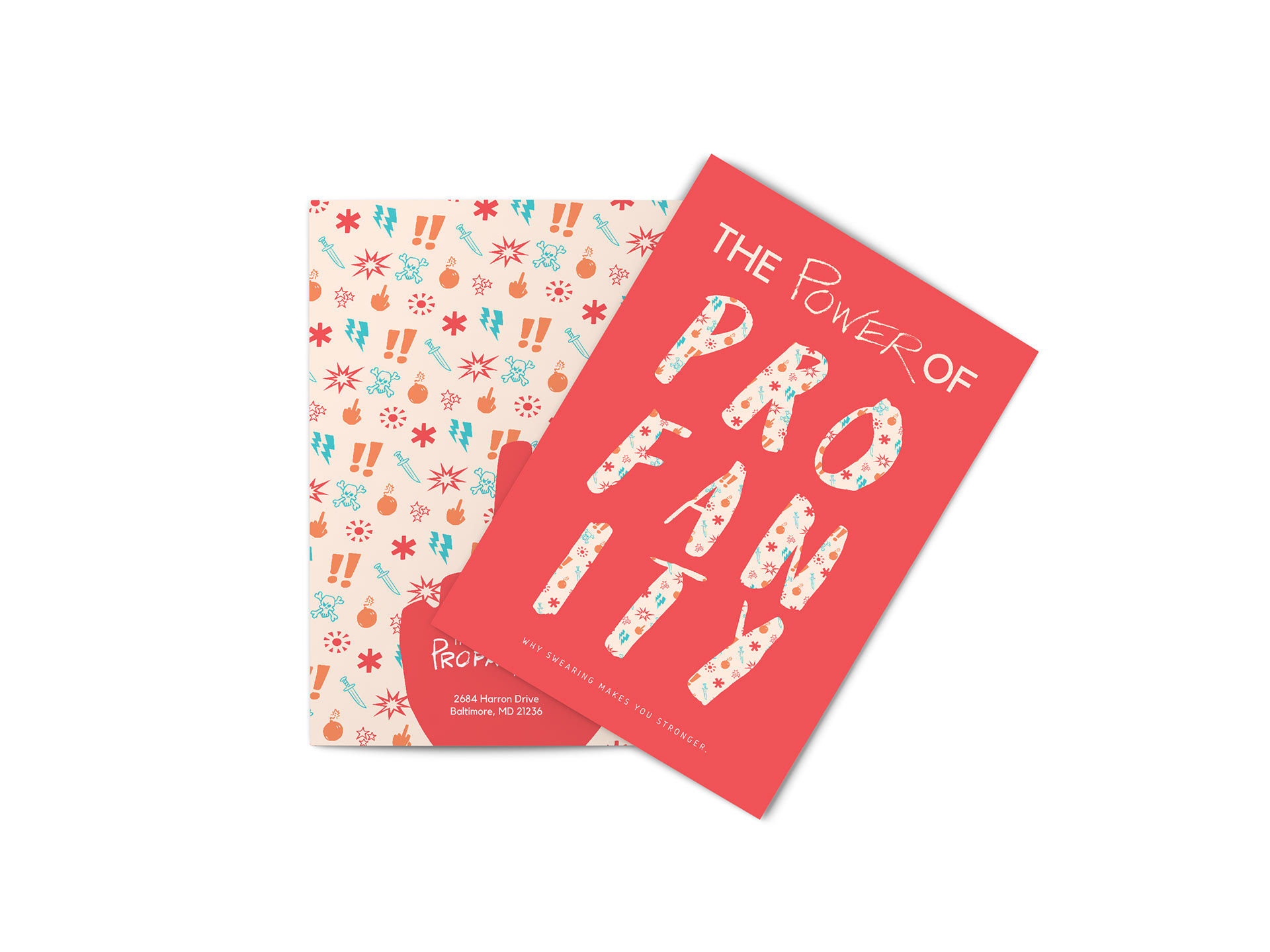
The brand identity of the Profanity Museum is playful. It tries to visually express the “release” one gets from swearing. The way that you can be so frustrated you want to tear your hair out, but as soon as you let out a nice “FUCK!!!” you are no longer seconds from giving yourself a bald spot.
