My team was placed in charge of refreshing the B-More Bags brand and aligning it with the House of Ruth brand, which was recently revamped. In this process, we had to define and consider the brand's target audience, assess potential marketing opportunities, be mindful of cost-effective solutions, and find new markets to increase sales.
Logo Design: B-More Bags' current logo above had no correlation to House of Ruth in color or style. We were asked to create a new logo and potentially a new "character" that was a revamp of the current logo, whose name was "B".
Below is our process and solutions:
We went with the design created by our teammate, Jenna, and offered adjustments.
Hangtag Design: The trick with the hangtags was to consider the handmade quality of the bags themselves. Incorporating this aspect of the organization into our design allowed for the opportunity to make something that was truly one of a kind.
Below are some preliminary sketches:
To accomplish this, we came up with the idea of having the hangtags feature the fabric of the products that were originally scraps from the workshop. We believed this would create an elegant design without costing anything extra.
In addition to this, B-More Bags wanted to use the hangtags as a place to tell the story of House of Ruth in order to keep customers mindful when buying their products. With this in mind, we formatted the hangtag to give the consumer the same interaction as opening and reading a book.
Below are the final prototypes:
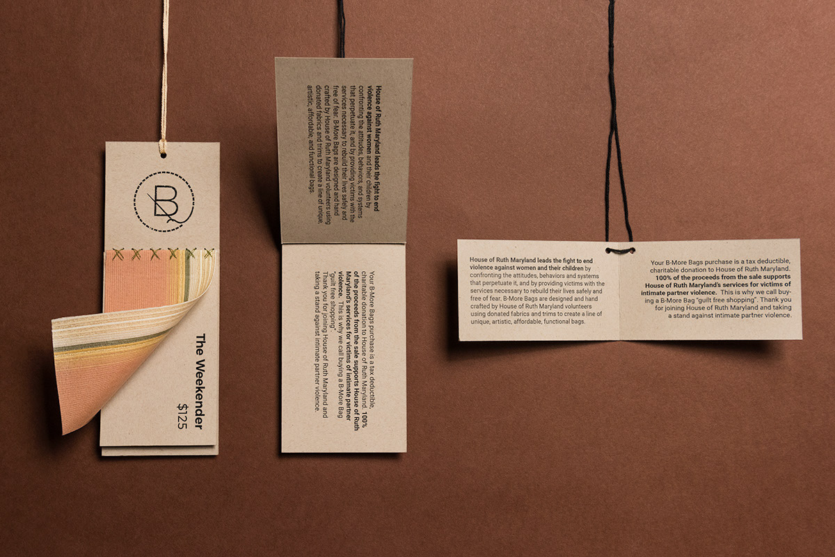
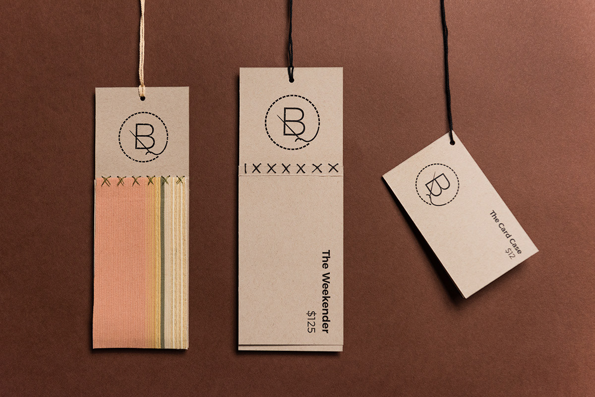
Icon Design: While some of us worked with the hangtag designs, others worked on icon designs. The representatives of B-More Bags requested we develop some icons that represented each bag they produced in hopes they would use them one day for a website.
Below are the results:
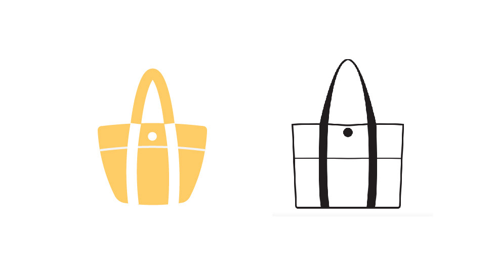
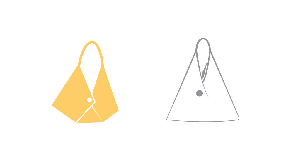
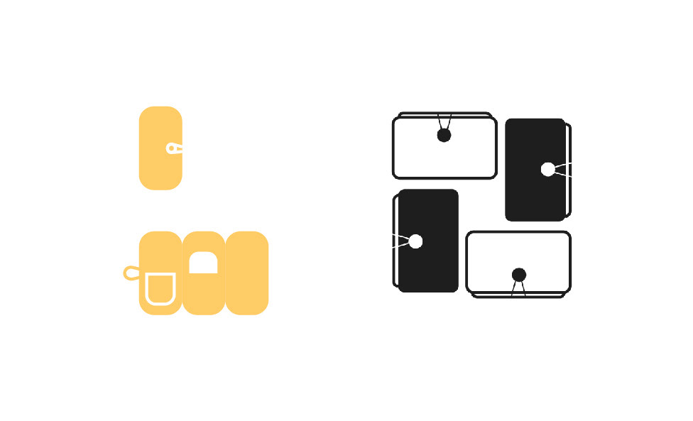
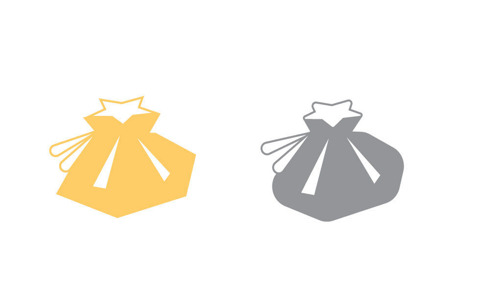
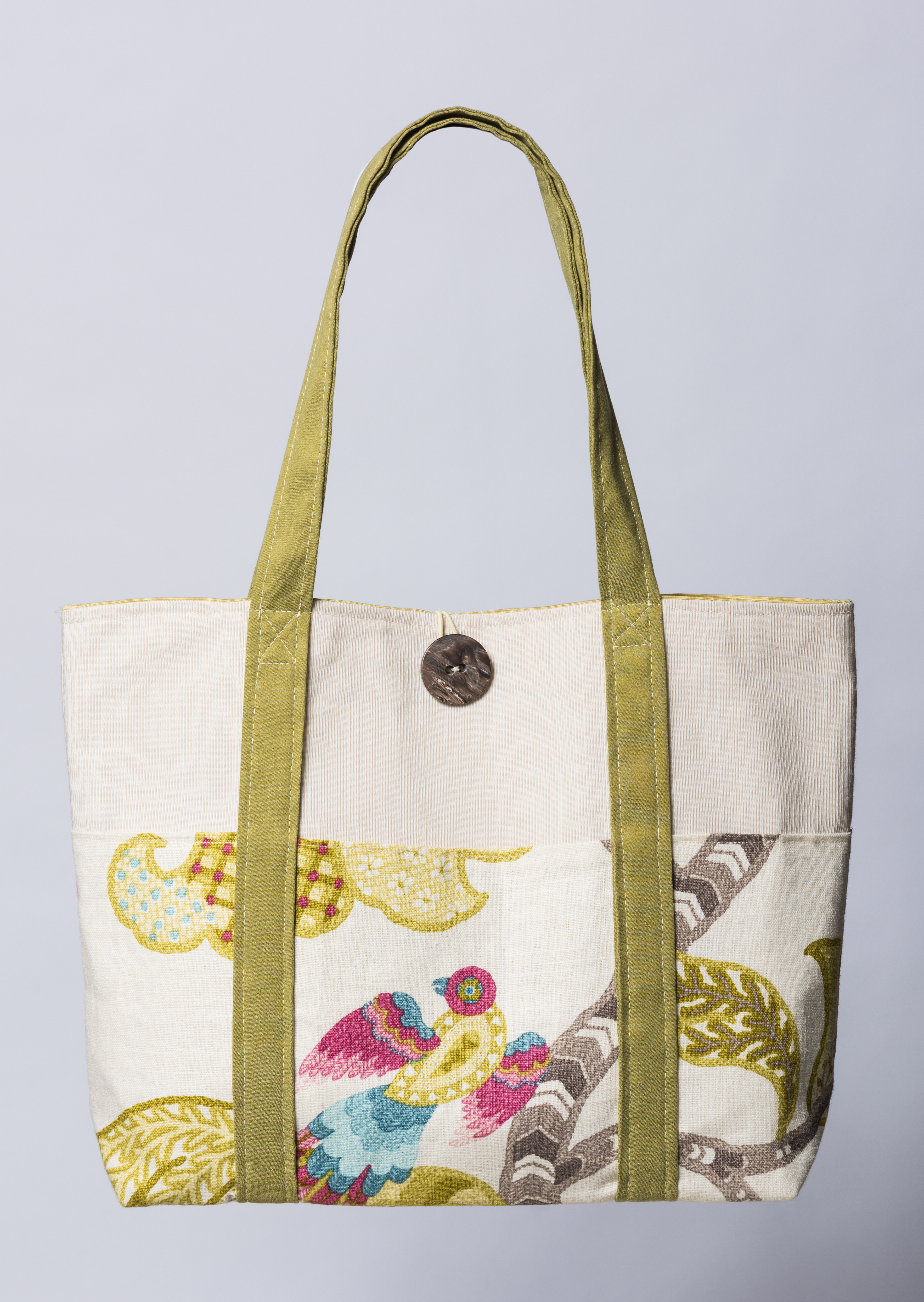
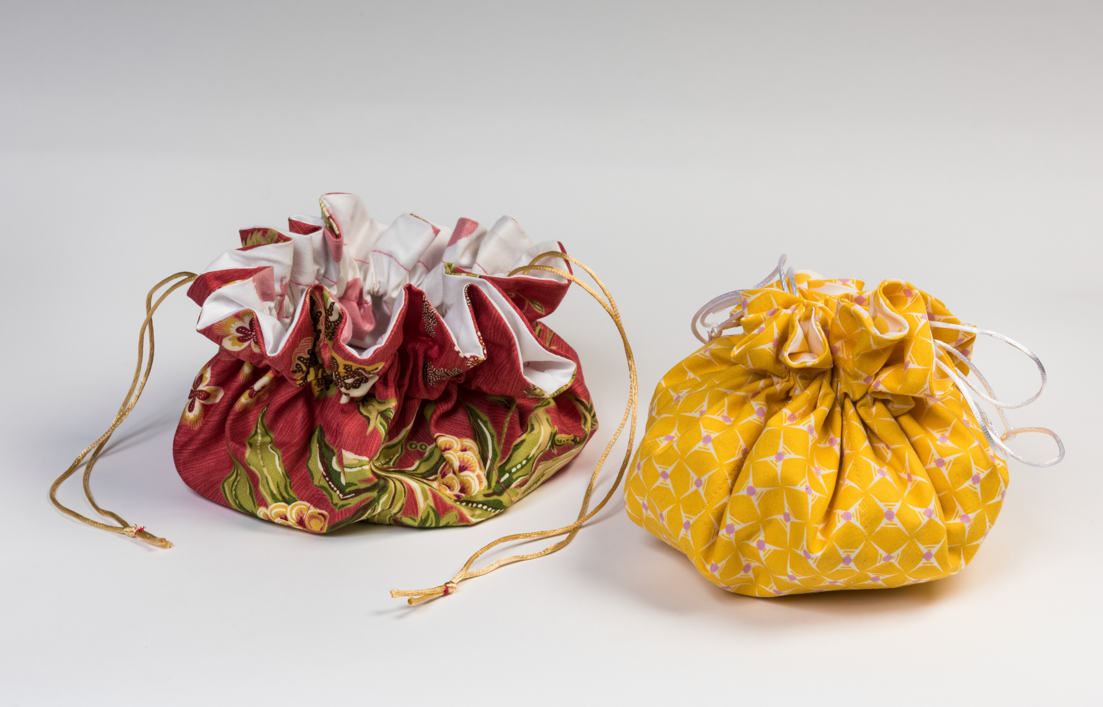
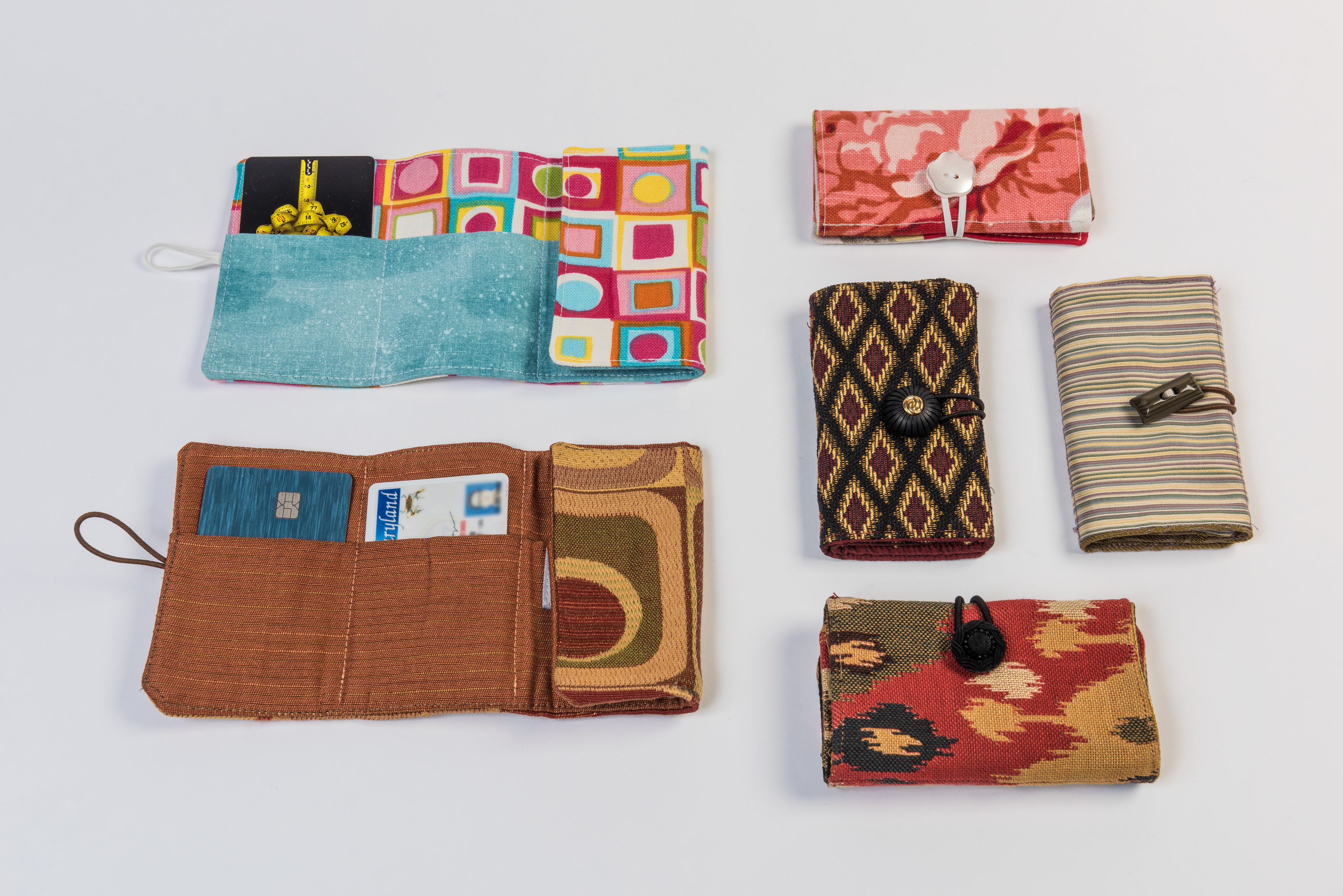
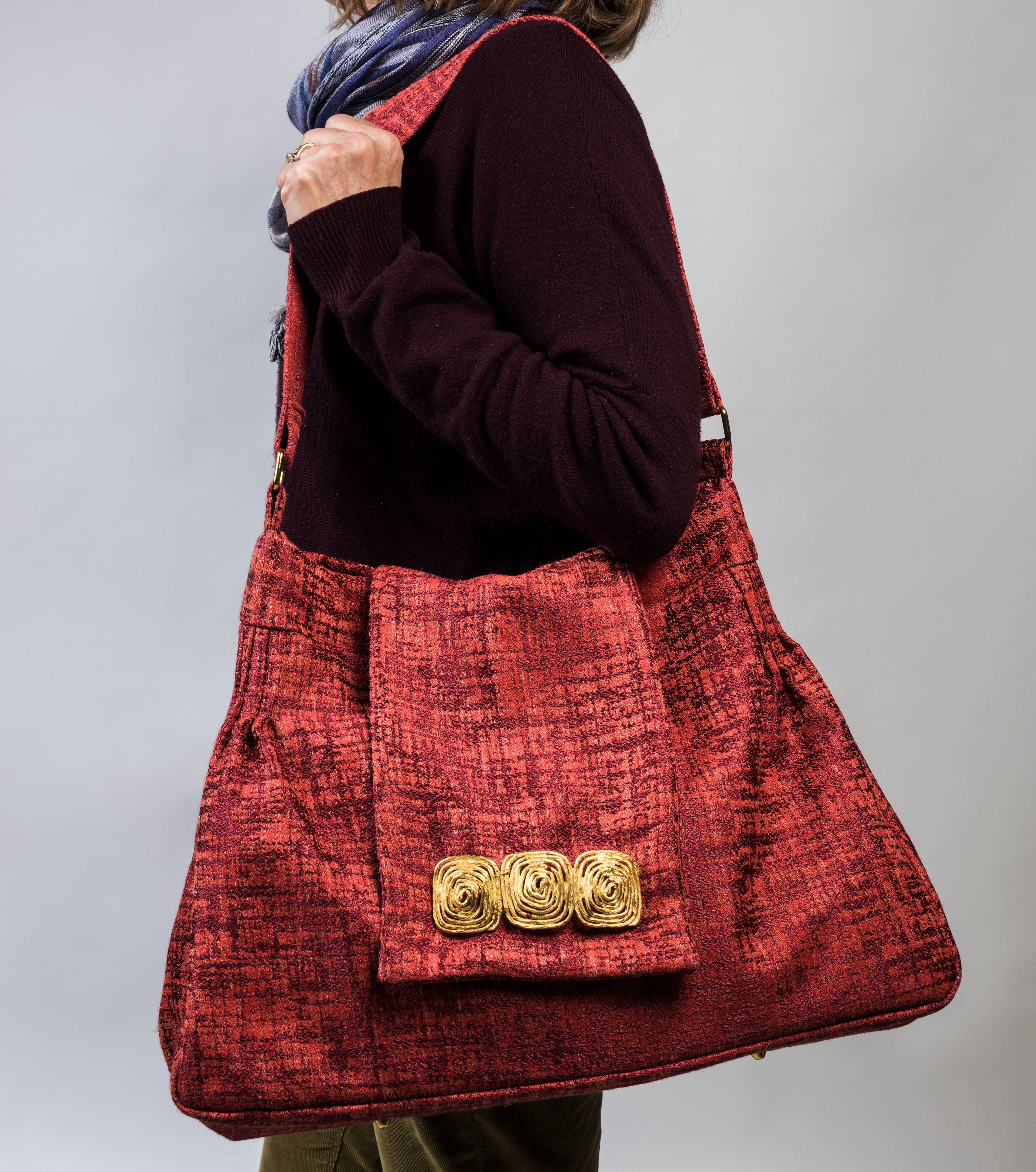
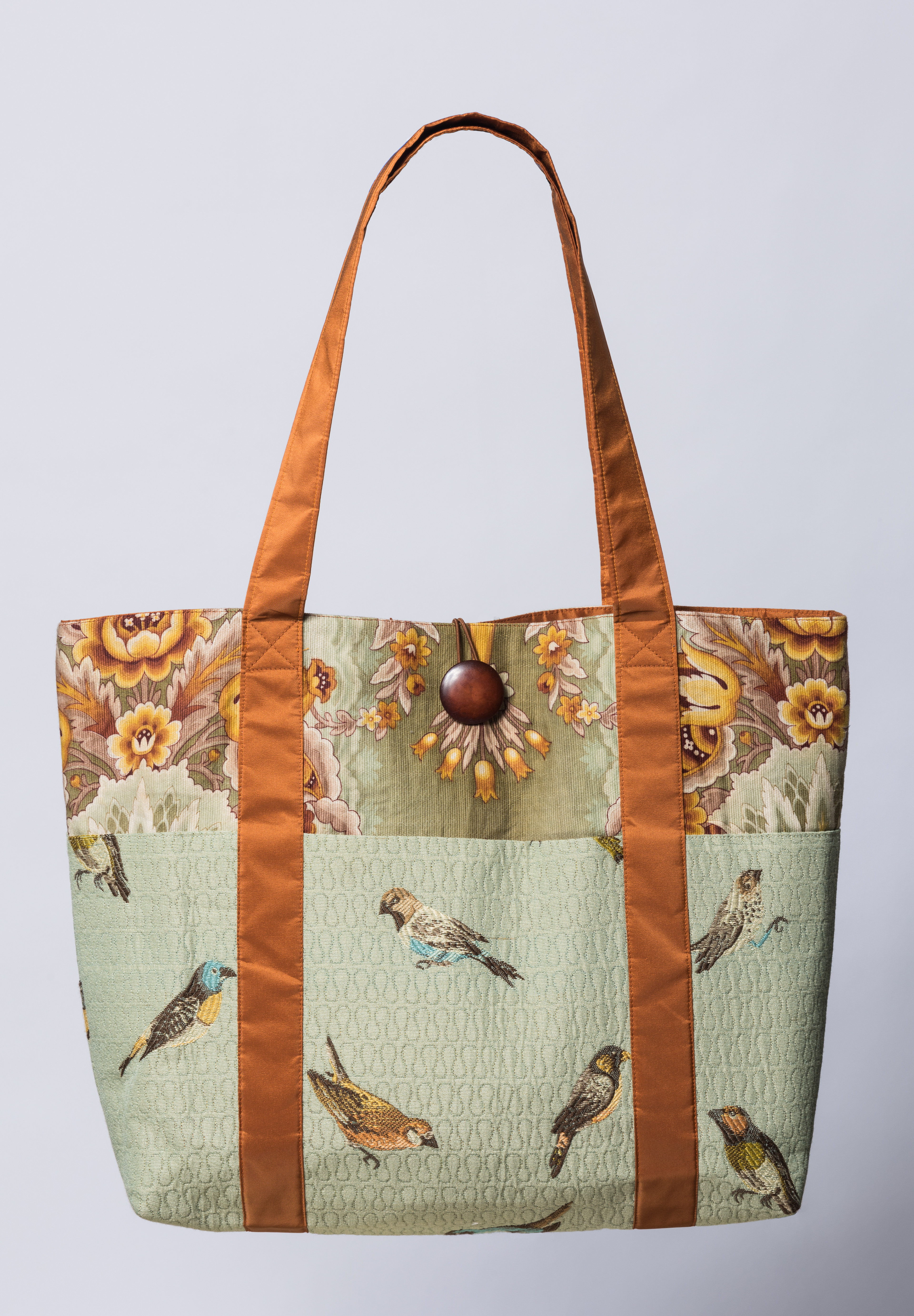
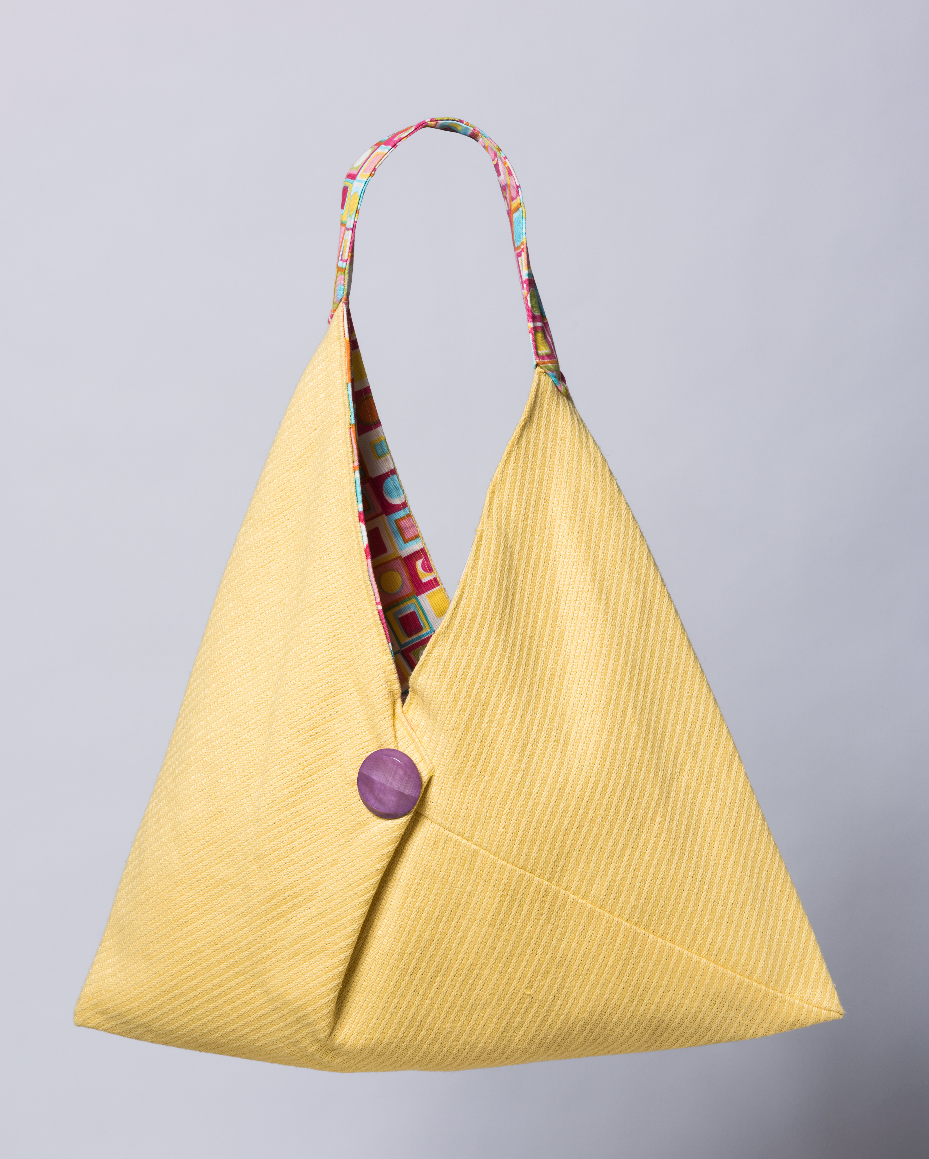
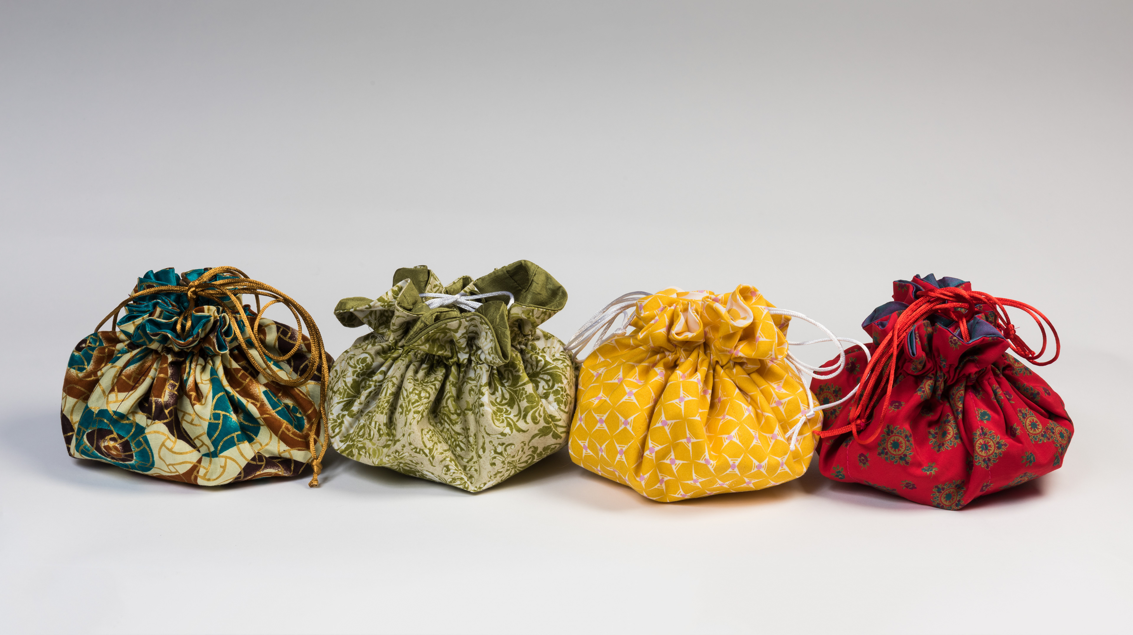
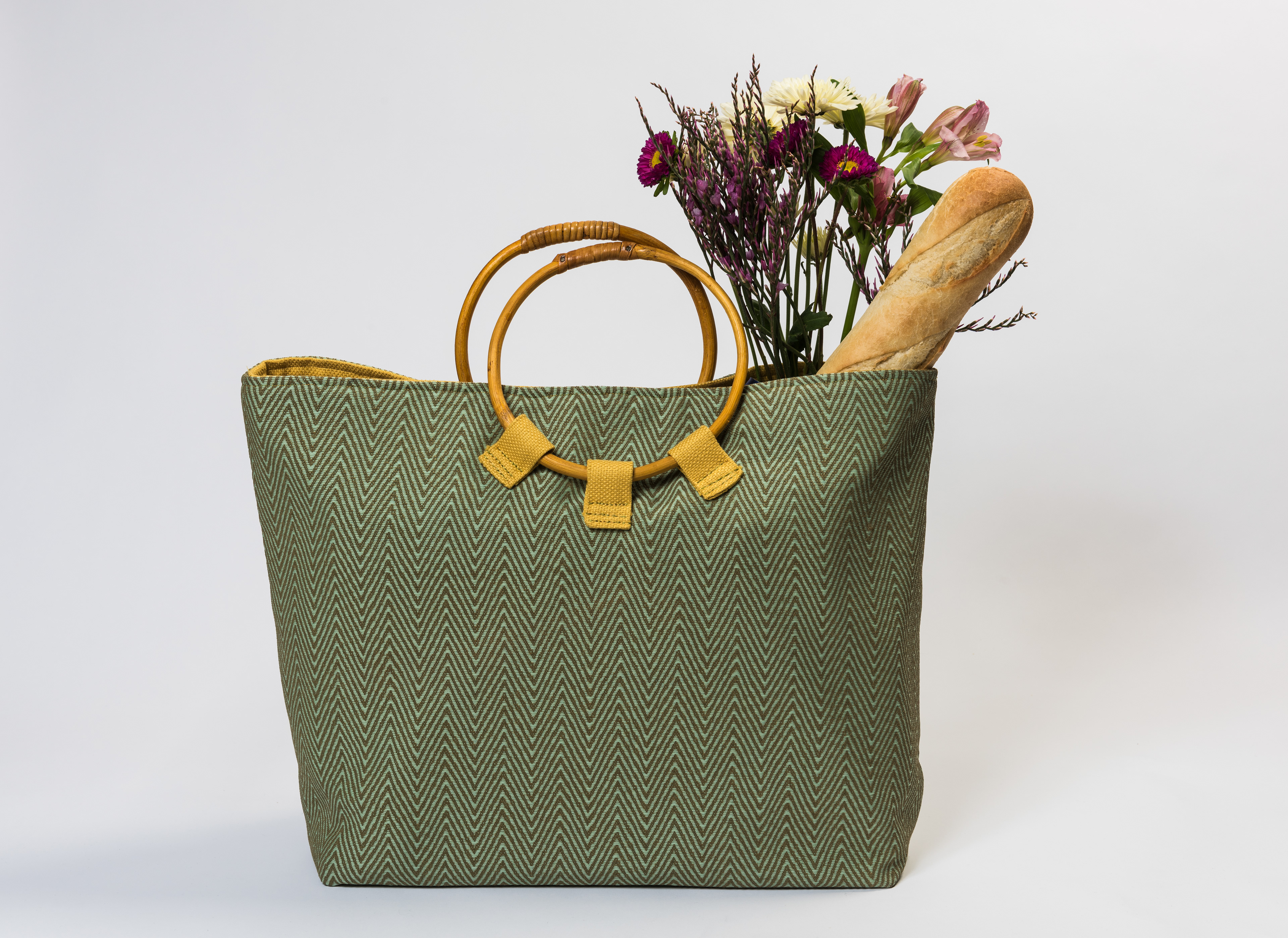
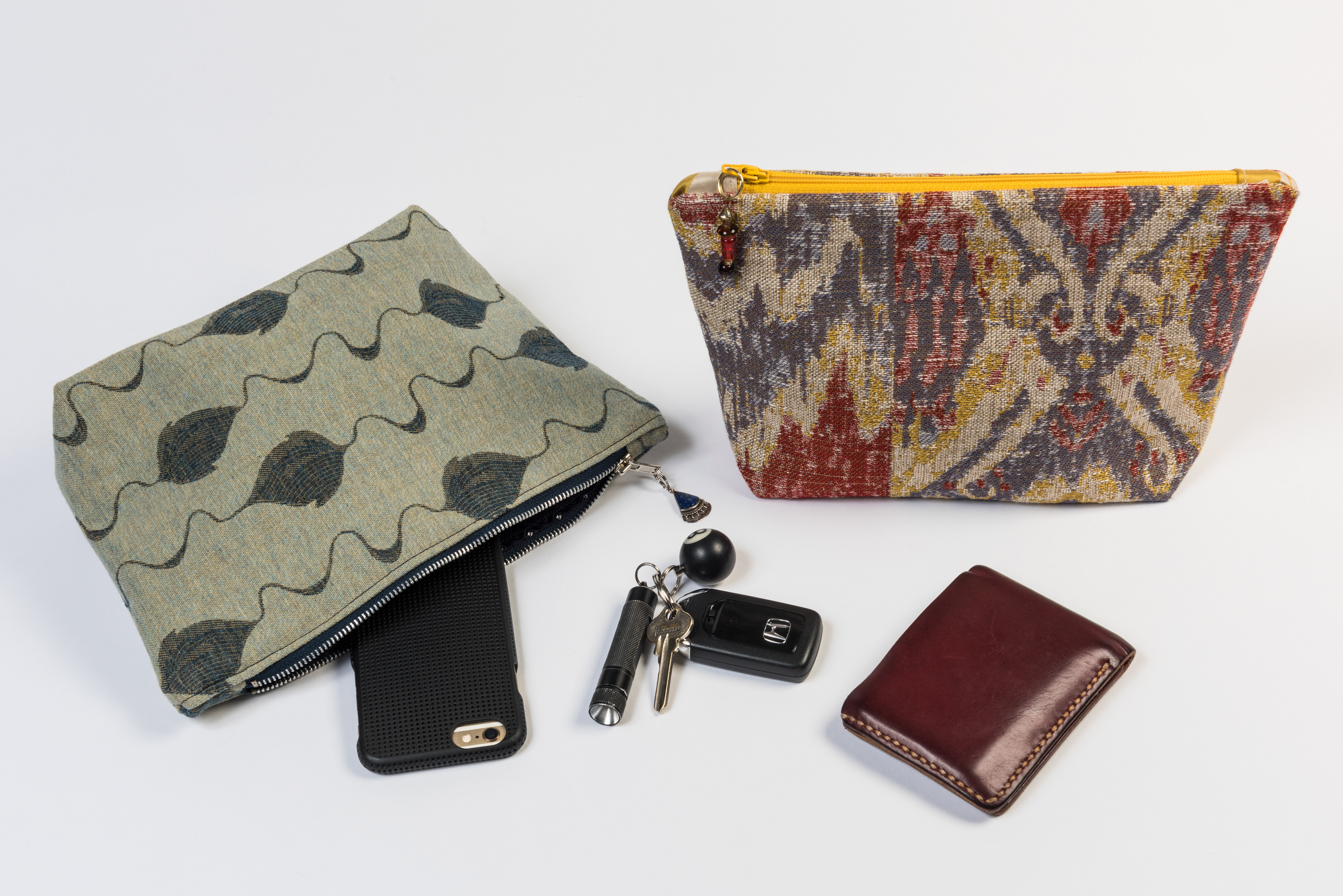
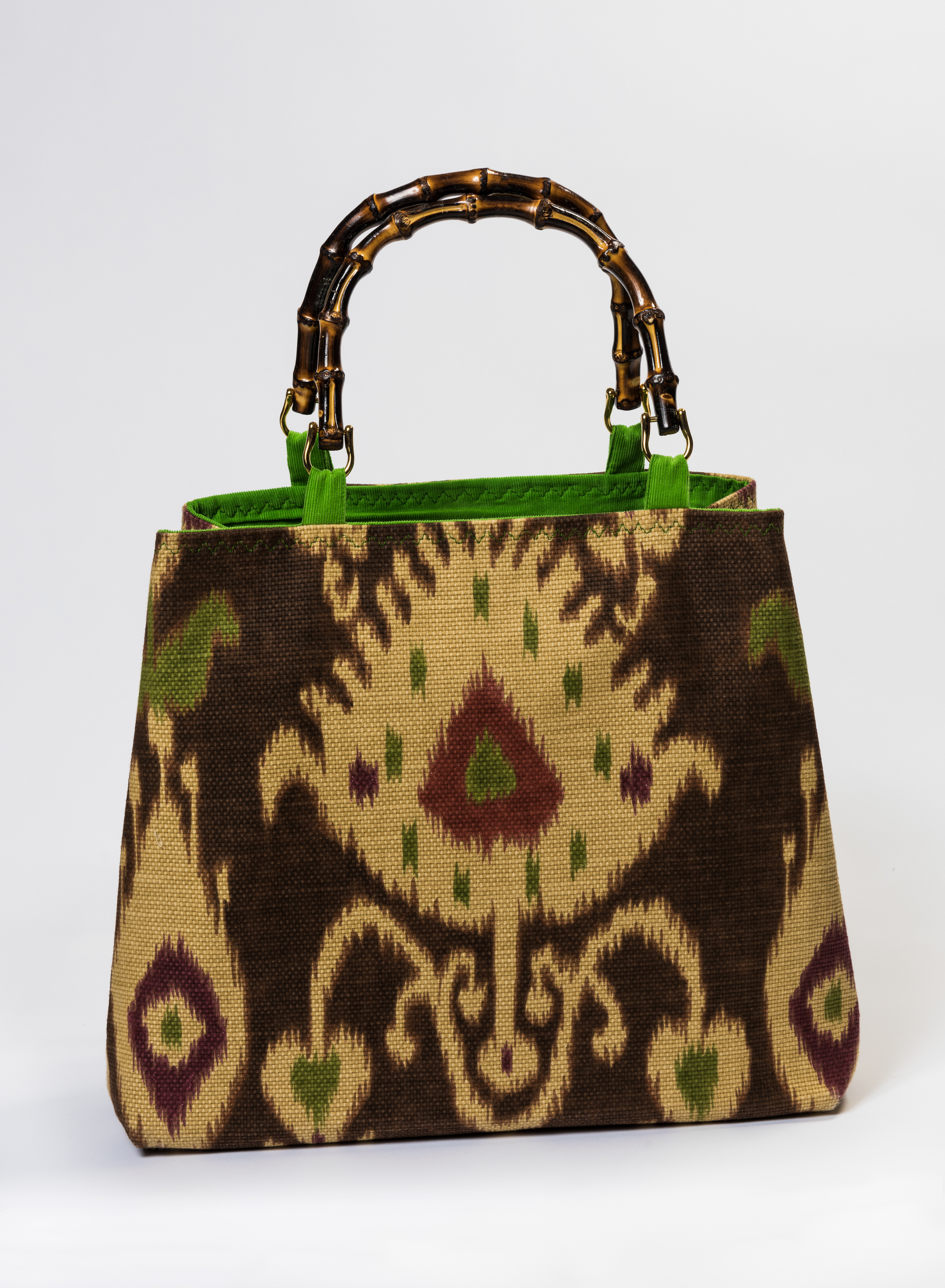
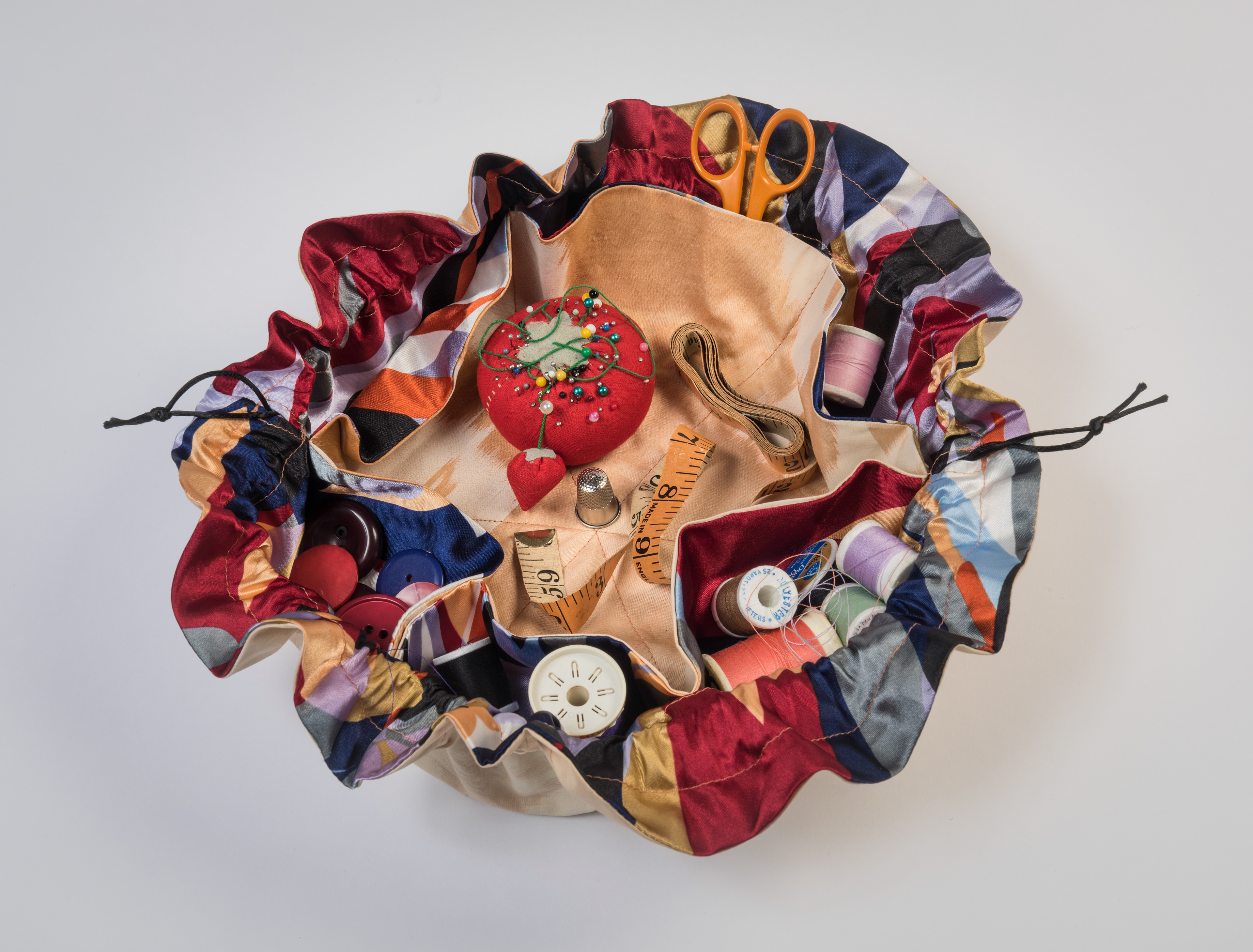
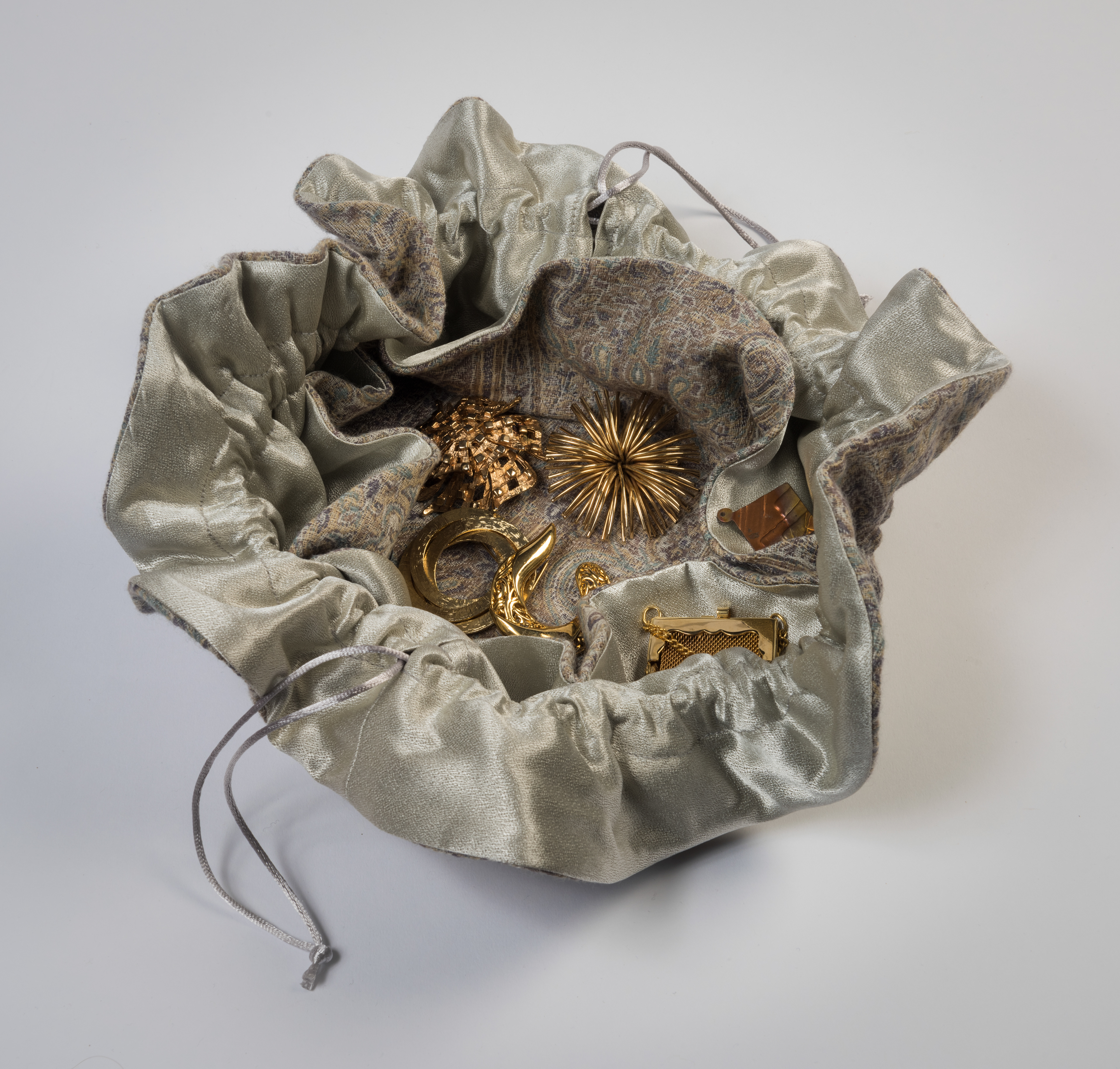
Photo Shoot: B-more Bags asked our team to help them photograph their current bag options for their website.
